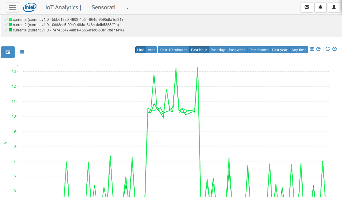
Is it possible to modify the line graph colors so when displayed, they contrast each other? The output is only shades of green...and a black line.
Attached is an example.
Thank you!
Chandler
連結已複製
1 回應
Chandler
Thanks for the feedback. Yes, we are changing the time series colors. It should be in our next major release, which will happen within a month.
(the reason they are the same color family is because they have the same unit-of-measure. I think you'd find that if you include a time series with a different component type using a different unit-of-measure, you would see other colors. However, we have received the feedback and we'll fix it).
Patrick