- Mark as New
- Bookmark
- Subscribe
- Mute
- Subscribe to RSS Feed
- Permalink
- Report Inappropriate Content
I use a desktop computer with a 4K monitor. The text display, that is the columnar layout is too narrow. For longer posts, I must unnecessarily scroll vertically due to paragraphs wrapping too soon. And for code posts containing code</> I have to unnecessarily scroll both horizontally and vertically.
Please take into consideration the display settings .OR. permit the forum message text box to be dragged wider.
Also, the Intel Community is now missing the HPC section.
And...
When I am in a section location, and start a new post, the New Message page does not remember the section I was creating the new message from.
Jim Dempsey
Link Copied
- Mark as New
- Bookmark
- Subscribe
- Mute
- Subscribe to RSS Feed
- Permalink
- Report Inappropriate Content
I second Jim Dempsey's criticisms of the new display format. I do not use tablets or phones (except landline). I use a PC or a Chromebook.
The second column of the new display format, i.e., "Recommendations", mostly contains useless stuff. Please give the user an option to turn off this column. For instance, when reading Jim's post, here is this "recommendation": Flashing Zenfone 5 Using Intel Phone flash tool. Softuses binary error . How on earth is this relevant to a reader of the Fortran compiler forum?
It is annoying to see a third of the display, already squeezed as it is, devoted to utterly irrelevant information. Please give the user some flexibility regarding what to see.
- Mark as New
- Bookmark
- Subscribe
- Mute
- Subscribe to RSS Feed
- Permalink
- Report Inappropriate Content
I agree with mecej4's comment regarding the (useless) recommendations, as they are " utterly irrelevant information" to the Forum thread.
Jim Dempsey
- Mark as New
- Bookmark
- Subscribe
- Mute
- Subscribe to RSS Feed
- Permalink
- Report Inappropriate Content
All good feedback. Let us take a look at that. I'm not sure what is possible but we'll take a look.
Thank you for the feedback!
Mary T.
Support Community Manager
- Mark as New
- Bookmark
- Subscribe
- Mute
- Subscribe to RSS Feed
- Permalink
- Report Inappropriate Content
Mary T.:
Thanks for looking into this.
Here is what I suspect: the engine scans the text of the post for individual words and, without bothering to decipher what the sentences mean, looks up other posts from other forums and recommends posts containing such words. Jim complained that he does not use a phone to read forum posts. So, the forum engine recommends a post about flashing a phone. If I write:
"Jim Dempsey is an unrepentant fink."
the engine will try to recommend posts containing "unrepentant" and "fink".
- Mark as New
- Bookmark
- Subscribe
- Mute
- Subscribe to RSS Feed
- Permalink
- Report Inappropriate Content
I agree with most of the comments. Why did you ruined the forum? It is difficult to understand.
Thank you for tagging me as a beginer, by the way, I am reporting a bunck of compiler bugs every year, but apparently participation and not quality is the only way to the top.
- Mark as New
- Bookmark
- Subscribe
- Mute
- Subscribe to RSS Feed
- Permalink
- Report Inappropriate Content
I am receiving an inordinate number of:
Occasionally deleting cookies helps (but that may be coincidental).
Jim Dempsey
- Mark as New
- Bookmark
- Subscribe
- Mute
- Subscribe to RSS Feed
- Permalink
- Report Inappropriate Content
I reported that 401 error the first day the new site opened - still not fixed. Yes, deleting the site cookies helps. It happens when you log in to the site and leave the browser open for some period of time.
- Mark as New
- Bookmark
- Subscribe
- Mute
- Subscribe to RSS Feed
- Permalink
- Report Inappropriate Content
The 401 occurred on my Windows 7 Pro system using FireFox 78.0.1 (64 bit)
I am writing this from a brand new laptop running Windows 10 Pro using FireFox 78.0.1 (64 bit)
Same version of FireFox, different O/S (clean slate of cookies)
Jim Dempsey
- Mark as New
- Bookmark
- Subscribe
- Mute
- Subscribe to RSS Feed
- Permalink
- Report Inappropriate Content
I agree the new layout of this peer-to-peer forum is greatly, greatly unsatisfactory and disappointing to say the least. For a peer-to-peer forum, can not the advice and feedback of some "peers" be sought before making the change?
Also, is there a way to display line numbers in inserted code samples?
- Mark as New
- Bookmark
- Subscribe
- Mute
- Subscribe to RSS Feed
- Permalink
- Report Inappropriate Content
Another issue is that there is no longer a "Scroll to top" link after posts or at the bottom of the page. I'd rather see the breadcrumbs repeated at the bottom of the page so that I can go back to the forum page without clicking twice, but now I have to scroll all the way back.
- Mark as New
- Bookmark
- Subscribe
- Mute
- Subscribe to RSS Feed
- Permalink
- Report Inappropriate Content
My avatar is gone, and I can't find a page to set it.
- Mark as New
- Bookmark
- Subscribe
- Mute
- Subscribe to RSS Feed
- Permalink
- Report Inappropriate Content
Hi,
Ok, I have a meeting set up for next week with a UX designer to review alternate layouts. We have several options and if you don't need the Recommendations section, we can use that extra space.
@Steve_Lionel asked about Avatars, I will look into this as well as the Go To Top Of Page buttons, and anything else posted here. This new platform just went live yesterday afternoon so give me a few days, but know that I am here to make this a great experience. Just ask and I'll see what I can do.
Thanks,
Mary T.
Support Community Manager
- Mark as New
- Bookmark
- Subscribe
- Mute
- Subscribe to RSS Feed
- Permalink
- Report Inappropriate Content
Mary T.:
A couple of more lost features:
All private messages from the past (about a decade's worth) gone. All uploaded and saved files and images gone.
No provision for replying to a post by private mail. No directory of members.
While composing this, I see below the text box the following:
- Mark as New
- Bookmark
- Subscribe
- Mute
- Subscribe to RSS Feed
- Permalink
- Report Inappropriate Content
Dear all,
I totally agree on everything what had been said about the functionality and the layout. It's not satisfactory on a desktop.
Further I noticed, that I cannot read the content without been logged in. So its closed for all, who have not an account? Is that intended or a bug? Is it the same for others, too?
EDIT: Once logged in, I can read and access without being logged in. So some cookie stuff maybe.
BR,
Johannes
- Mark as New
- Bookmark
- Subscribe
- Mute
- Subscribe to RSS Feed
- Permalink
- Report Inappropriate Content
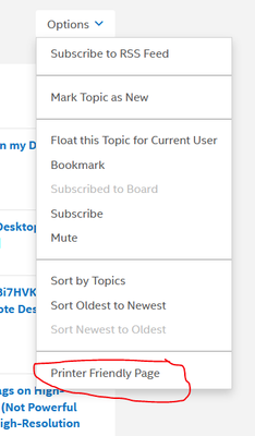
When you are viewing a topic, have you tried selecting "printer friendly page" in the options?
It removes the recommendations and it might help in the interim.
Doc
- Mark as New
- Bookmark
- Subscribe
- Mute
- Subscribe to RSS Feed
- Permalink
- Report Inappropriate Content
Yes the printer layout is much better.
I just had 20 emails from the forum about "badges" I have "earned" whist doing pretty much nothing. I have managed to find the switch it off setting, hope that works.
- Mark as New
- Bookmark
- Subscribe
- Mute
- Subscribe to RSS Feed
- Permalink
- Report Inappropriate Content
Thanks, Al Hill, I would not have thought of trying to be printer friendly since I don't have a printer.
Secondly, if you choose "printer friendly", reply to a post and go back to browsing, you will again be in user-unfriendly mode. You have to find the Options button again by scrolling back to the top of the page, and choose "printer friendly" again. Intel, please let users choose "printer friendly" as a sticky setting. In monitor unfriendly mode, I found one post that filled up my 1920 X 1024 screen allowed only three lines of text of about 90 character each. The rest was space, titles and peripheral information such as "Kudos", etc.
In the toolbar above the box where we type in text, there are no buttons for
- entering special characters such as mathematical symbols, greek letters, etc.
- entering subscripts and superscripts
- quoting sections of text
as we did in the two previous versions of the forum.
- Mark as New
- Bookmark
- Subscribe
- Mute
- Subscribe to RSS Feed
- Permalink
- Report Inappropriate Content
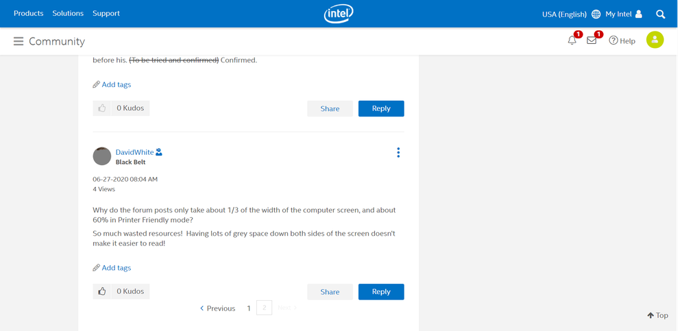
Why do the forum posts only take about 1/3 of the width of the computer screen, and about 60% in Printer Friendly mode?
So much wasted resources! Having lots of grey space down both sides of the screen doesn't make it easier to read!
- Mark as New
- Bookmark
- Subscribe
- Mute
- Subscribe to RSS Feed
- Permalink
- Report Inappropriate Content
To reinforce what David wrote, here is how I see his post using the Opera browser on Windows 10, on a 1980 X 1024 monitor.

- Mark as New
- Bookmark
- Subscribe
- Mute
- Subscribe to RSS Feed
- Permalink
- Report Inappropriate Content
It displays quite well if you detach the browser tab and make a tall thin window e.g 500 x 1100 but it seems crazy that you have to do that and then scroll up and down more as a result.
- Subscribe to RSS Feed
- Mark Topic as New
- Mark Topic as Read
- Float this Topic for Current User
- Bookmark
- Subscribe
- Printer Friendly Page

